The text content represents more than 80% of your design, so understanding typography is crucial. Always put readability first.
Typography Basics
It’s important to learn these typography terms and what they mean. These names will be employed often when explaining typography.

abcdefghijklmnopqrstuvwxyzabcdefghijklmnopqrstuvwxyzabcd
Body Text
Pick a font that looks good in the body text. When in doubt, pick one that is both clean and comfortable to read. San Francisco, Helvetica Neue, Open Sans, Roboto, Proxima Nova and Museo Sans are some of my favorites. They’re all available for free on Google Fonts and Typekit (with Creative Cloud account).
Font Size
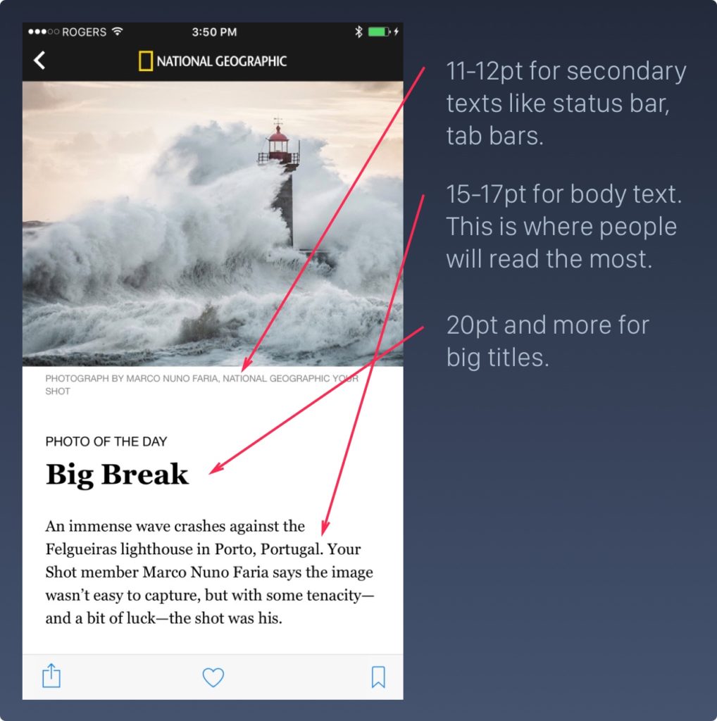
The font size should be at least 11pt to be readable on the iPhone, iPad and Apple Watch. While that is the minimum value, the recommended size for the body text is actually 15-18pt.
Font Weight
Use bigger texts for titles and reduce the font weight to Light, Thin or Ultra Thin. Otherwise, they would steal too much attention from the rest of the content.
At 12-18pt, use Regular. At 18-24pt, use Light, at 24-32pt, use Thin and at 32pt or more, use Ultralight. Notice that for each scale, the text remains readable while looking clean and sophisticated.
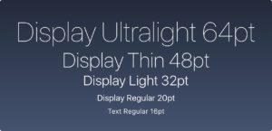
Modern fonts have variable font weights: Regular, Light, Thin and Ultralight.
Line Height
The line height should be between 120% to 145% of the font size.
The right example has a line height that equals the font size (100%). In the left, I applied a 145% scale. The difference is substantial. Now, multiply that quantity of words by 10 and you get an idea of how frustrating it can be to have to read such condensed text.
45-90 Characters Per Line
When your line is too long, the reader will have a hard time focusing. The overwhelming amount of text per line wears them off, because each jump to a new line gives excitement and that happens less when lines are too long.
Use Your Typeface Wisely
It’s one thing to know about typefaces, it is another to know how to use it. Beautiful typography doesn’t just happen, you have to carefully curate and customize it. For instance, don’t force bold or italic if the font doesn’t support it.
Use italics, underline, bold, lists and colors to reinforce the hierarchy and interactions.
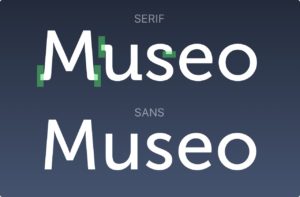
Serif and Sans-Serif
A sans-serif typeface is one that does not have the small projecting features called “serifs” at the end of strokes. Both Serif and Sans are good choices.
The Serif fonts are more commonly used in more traditional apps that encourage reading and storytelling such as Medium, iBooks and The New York Times. It has a lot of charm. Personally, I believe it’s important to go back to our roots when it comes to design, so I would definitely encourage using Serif fonts for storytelling. As they’re less used in modern apps, you get a unique feel to them.
The Sans typefaces are more utilitarian and neutral, used widely in most modern apps. Its popularity also means that it’s more generic. The amount of Sans serif typefaces out there is overwhelming, so pick carefully.
Resources
Typography is an art form that is worth exploring. It goes well beyond iOS and has a deep history. When you’ve reached a level where you can call your craft Art, that is the biggest achievement that you can get.
Typography Guide
If you’d like to learn more about combining typefaces, apostrophes, quotes, dashes and brackets, I suggest heading to typogui.de.
Guide to Pairing Fonts
At some point, you’ll want to have multiple fonts in your design to set a contrast between body text and titles, captions or block quotes. This guide is particularly helpful to help you pair fonts based on a set of criteria.
Hand Lettering
There is also a fascinating course for hand lettering. With these techniques, you can create logos, personal brands and explore typography in general.