DEFERENCE
- Content is hero, UI is secondary.
- Simplify
- Maximize content
- Color. Use prominet color to show that an element is tappable or that it’s hightlighted.
- Neutral tones are used for backgrounds to give focus on content and CTA.
- Light gray is used for inactive states.
- Typography is content
- Negative spaces. Minimum distance 8pt is recommended between borders and content. 5pt or more is recommended between each element.
- Icon states: outline and fill mode.
CLARITY
– Make things obvious. buttons should be self-explanatory and typography should be big and readable at comfortable idstance.
– Make text readable. Minimum size is 11pt, optimal size for reading is around 16pt.
– Use obvious icons.
– Descriptive Screens
– Meaning in colors.
DEPTH
- Transitional interface.
- Blurred background.
- Make it delightful. 3 things that can make your app really stand out: animations, gestures and sounds. It’s really easy to go overboard with them, so use with moderation.
- Animation
- Gestures. Less obvious than a visible button, a gesture can be an extention to an already visible interaction.
- Sounds
San Fransisco

Points and Pixels

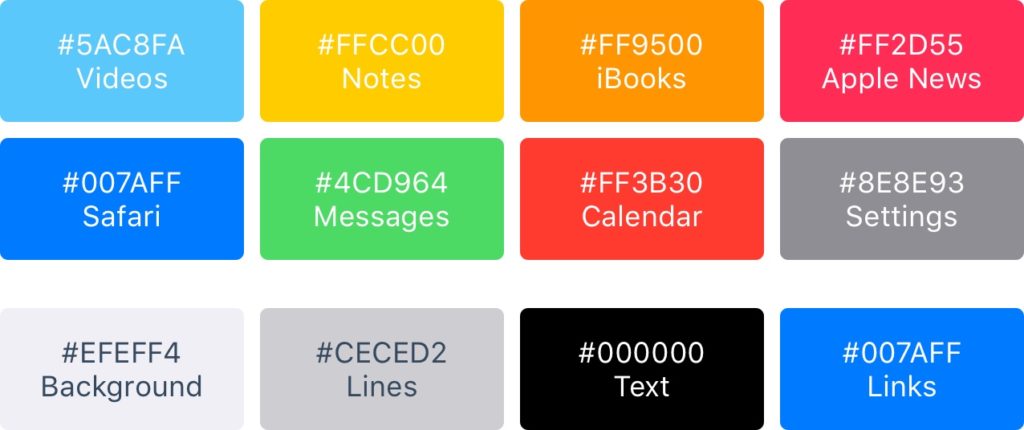
Colors
iOS uses vibrant colors to bring out the buttons. These colors tend to work well against a white background as much as a black background. Keep in mind that colors should be used sparsely, for call-to-actions and minimal branding areas like the navigation bar. Roughly, only 10-20% of your design should have colors, or they will compete too much against the content.
Keyboard
The keyboard is used to input information in text fields such as search, chat or login. It’s highly customizable, for URL, Email, Phone numbers and even Emoji. You can choose between the Light and Dark themes, as well as how the action button is named (return being the default).

https://dribbble.com/shots/2262120-iOS-9-Sketch-Keyboard-Kit
iOS Human Interface Guidelines by Apple
A high level and essential read by Apple, even if it’s just scanning the whole thing. iBooks format is also available.
iOS Guidelines by Ivo Mynttinen
http://iosdesign.ivomynttinen.com/