App Store screenshot is one of the reasons for people want to download your apps from the App Store.
There are 10 types of screenshot as described by Dan Counsell:
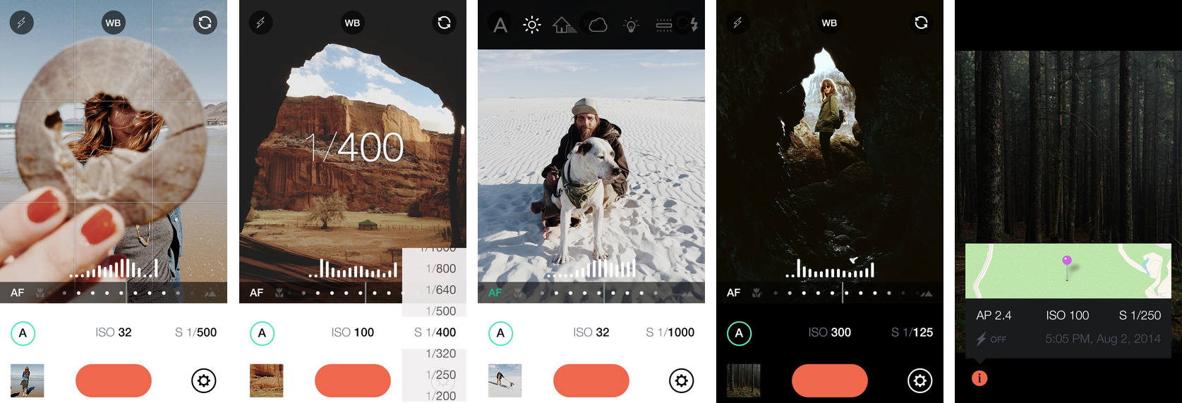
1. Classic Screenshots
Classic as it is, just screen shot directly from the app from device or simulator without any touch up.
2. Flat colour backgrounds with devices
This sytle of screenshot will often feature a device on a coloured background with some descriptive text, either above or below the device.

3. Blurred backgrounds with devices
This style is most common amongst photography and cooking apps.

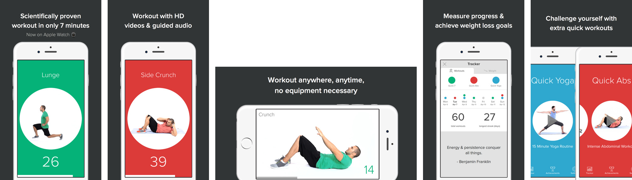
4. Tutorial Based
For app that is use completely new way to use it, it’s a best place to teach user how to use it. Like Heads Up! app.

5. Connected

6. Splash Screen
The first screenshot is like an advert. It doesn’t not show the app, but instead offers a clear message on what the app is for.
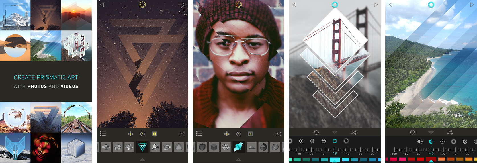
7. Photographic Elements
Using the real world settings. It certainly makes it easieer to imagine how an app could fit into your life.

8. Mixed Orientation
It shows that the app is ‘well-oriented’.
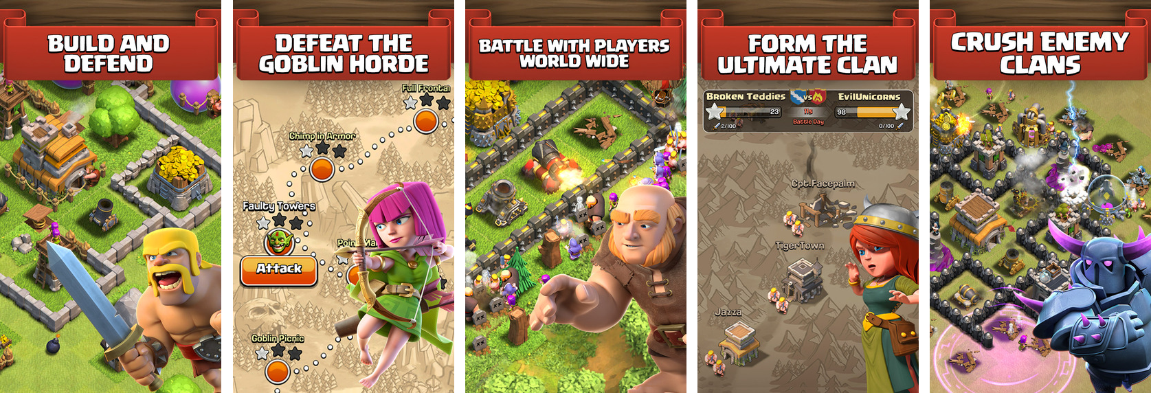
9. AAA Games
AAA titles with IAPs, tend to overlay characters on their screenshots.
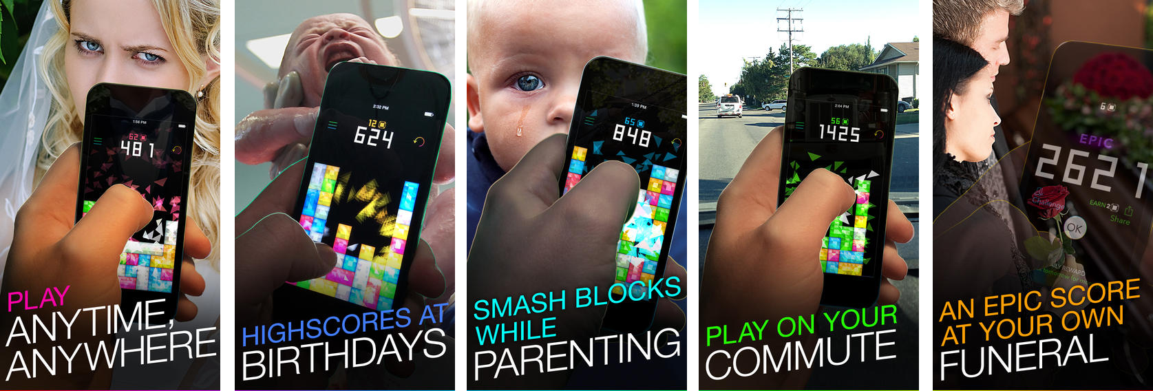
10. Humour
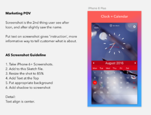
What we do
We use simple combination of #2, use gradient or flat background, with screenshot. With device or without device. Here is some specification.
Reference:
Template
App For Developers:
App Icon Resizer