Good design is not easy
When we see designers doing their job, we tend to think that’s looks doesn’t too hard. And that’s right, great design can seem obvious or effortless. But what make it difficult is to answers like these questions:
- what are we making?
- what features do we want?
- where do we start?
- who is it for?
- what do users want?
- where should this button go?
- what colors should we use?
- can we build it?
- how do we explain it?
- does it work?
- is it useful?
- how long will it take?
- will people buy it?
- will it make money?
- does it look good?
- did we get right?
These question doesn’t have obvious answers, and it’s always challenging even for the most experienced designers. Trying to answer these questions can be a daunting task. But we have to do it anyway because ‘design matters‘. It’s profound, because it has impact on the quatlity of the product and people who are use it.
Not shortcut for good design. Good design is not effortless it takes time, commitment, concentration and rigor. However there are techniques and tools to help you to make the process easier.
Case Study: Food Ordering App
For this case we will making an app to help people from queing long and wait for long time to buy a meal. With this app we can see the menu and place an order.
What we are making? Ordering app
⬇️
Which features are most important? What do our users want? Our app is awesome… but for whom?
What Are We Making ?
Define your app. List down all the featues that your app can do, identify the most used and important features. To determine what your app should do.
Step 1:
What could the app do? Collect all the feature that the app can have. Brainstorms ideas, note down every possible ideas.
Feature ideas:
- Menu of entrees
- Entree details
- Place an order
- Catering
- Notifications
- Request entrées
- Schedule delivery
- Favorites
- Entrée ratings
- Quick reordering
- Loyalty rewards
- Feedback link
- Ingredient search
- Dietary preferences
Step 2:
Who will use he app for and what they need? Who your user is? What their goals are?
You ≠ the user
the User ≠ everyone
Focus on the essential target for the app.
Ask question to customers:
- Prefer a fresh meal or pre-made items?
- Take a long lunch or eat quickly?
- Get the same thing every day or try something new?
- Eat healthy or get whatever looks good?
Our customer’s Goals
- Enjoy a fresh meal
- Eat quickly
- Try something new
- Make healthy choices
Step 3:
What are your app goals? (quality user want)
- Offer a convenient, simple delivery service
- Highlight entrées
- Make diners happy
Business goals: (result we want)
- be profitable
- earn a great ROI
- optimize food costs
Step 4:
What should it do?
From the feature ideas, filter the features with what our users wants.
- Menu of entrées
- Entrée details
- Place an order
- Schedule delivery
- Entrée ratings
- Feedback link
How Do We Start?
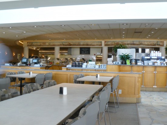
Start with what you know. For example if you think about messenging app? it would be the conversation screen. Dating app? profile screen. In this case food delivery app? the menu of food that people can order from.
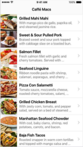
How to draw UI. In this case we use Sketch app. Use screenshot as references, and use believable content.
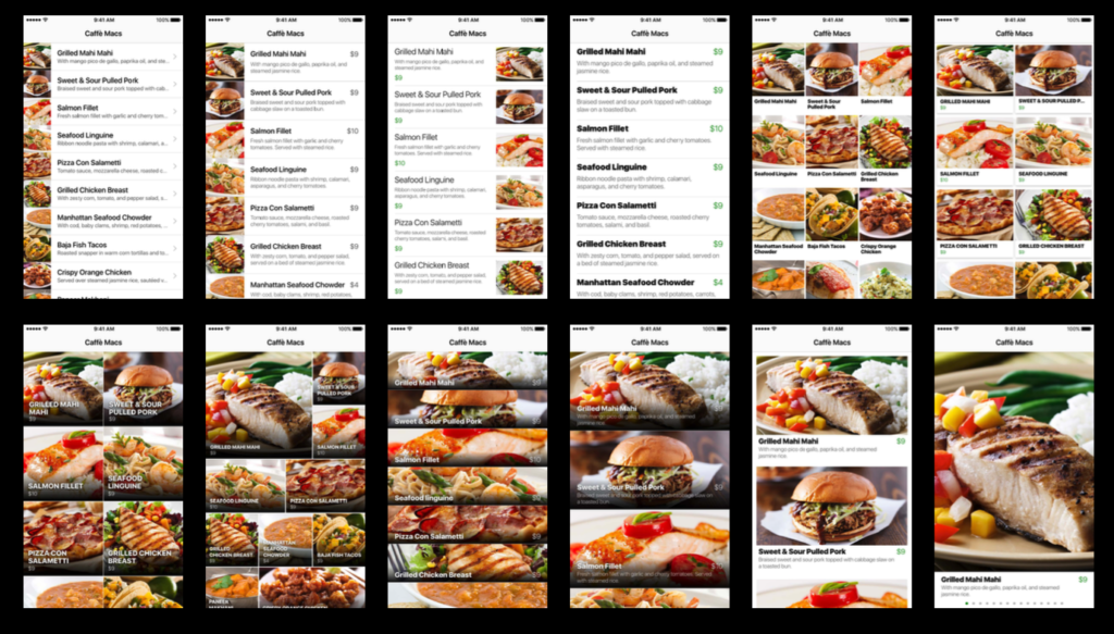
It’s so tempting work on the next screen, but does the design is really good? One idea is no enough. You cannot know if your design is right, if you only try with one idea. Instead you need to look at the problem at another angle, iterate on your design.
What we can do differently? Make the photos bigger, add more contents, changing the layout, add prices, typo graphy, how about the menu don’t have photo, make the title bolder and so on. How about image oriented, bigger images. By asking this question we can create more alternatives screen.
Iterate
- Layout
- Typography
- Proportions
- Information density
- Opposites and extremes
- Navigation
- Combine ideas
Judge the screens
On this stage you need to remove ego and prides, when being judges on these mockups. Ask question for each mockups like:
- How well does it serve the goals?
- Does it include the right information?
- Is it intuitive? Is user familiar with the UI?
- Does it feel right? Personality, the appearance that you want.
This is very subjective, and by answering honestly will help to find good design.
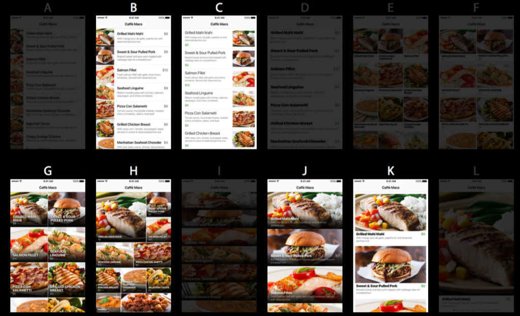
Eliminates screen that is no that outstanding by half. Then from that eliminate by half by again.
Remove one more.
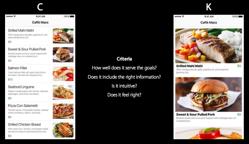
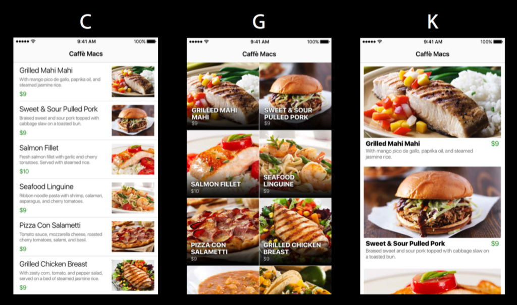
Again, ask the questions that meets the criteria. So both lasts are pretty good candidates. Depend on your side which one to choose. But for Apple design team, and they crowd too, they ended up with K.
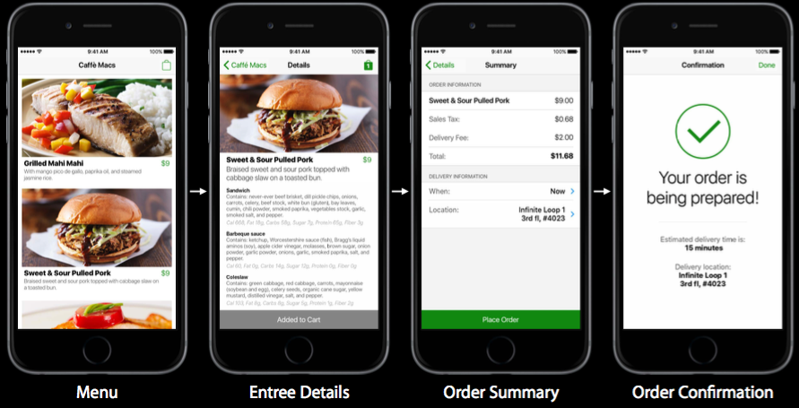
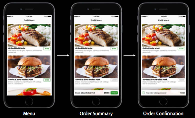
Workflow
A workflow is the set of steps it takes to complete a task. For example this is the first idea for the workflow, but actually has lot of flaws.
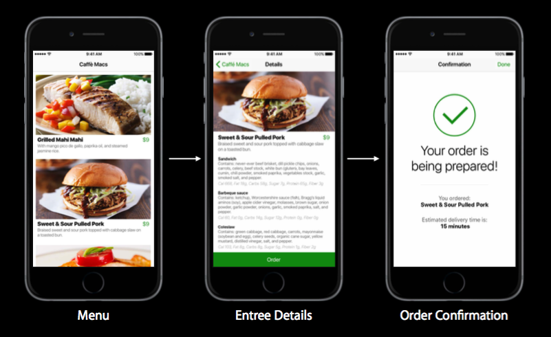
Shopping cart style:
Order from menu screen:
On the menu there is button to quickly order, it will show on the tray. You don’t have always to open the detail screen to put in the cart.
What’s The Right Design?
Start with what you know. Then try lots of ideas on how to make it different. Critique your ideas to find the best one.
Sources: https://developer.apple.com/videos/play/wwdc2016/805/
#wwdc2016 #design